Get spotted out in the wild
Creating a graphic line that represents you.
Is leopard print in or out this season? Not a question asked in the animal kingdom. Creature colours, textures and shapes are not chosen because they look pretty. These characteristics tell other animals whether they are a threat, looking for a mate, need protection, or perhaps not telling anything by way of camouflage to hide in plain sight. The way an animal looks lets nature recognise them, and learn how they fit within an ecosystem.
It is the same for brands, they must look a certain way to be instantly recognisable to their clients and overall target. But a look must be curated and well thought out.
The intention is to represent the brands’ values and personality while exuding a visual appeal that always registers.
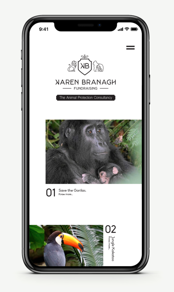
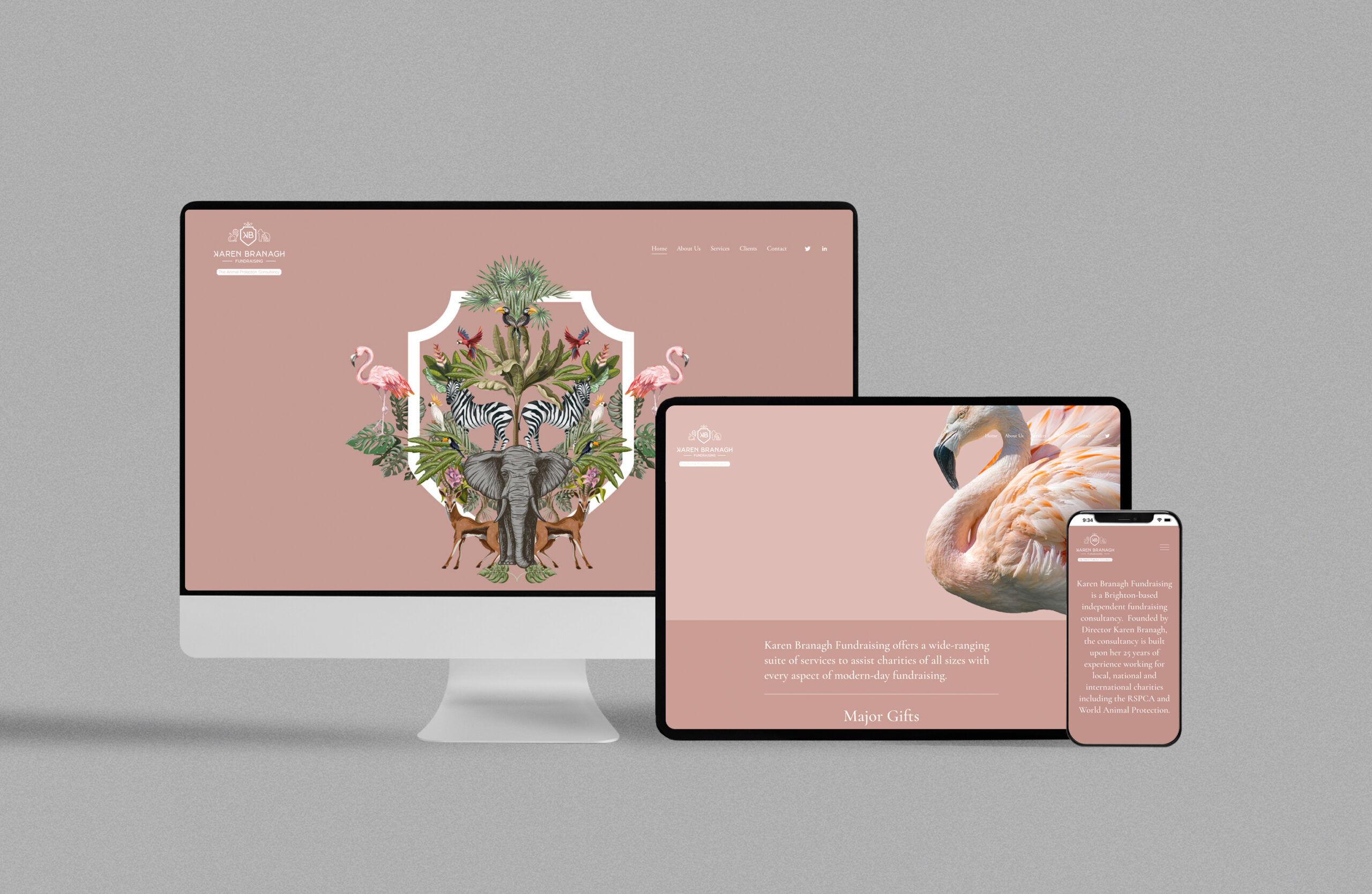
Karen Branagh Fundraising is a consultancy for companies in need of specialist fundraising related to animal rights. The project was to develop a corporate, visual image that represented the essence of both the company and its creator, with a focus on its role in animal protection.
We opted for an elegant, delicate aesthetic that portrays Karen’s personality, plus integration of a core focus to attract and hold attention: the animals.
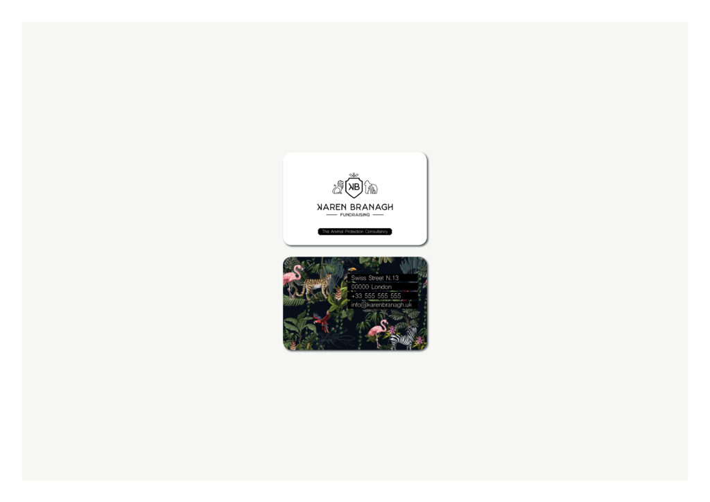
Once we had created the whole graphic line, we were able to design its main element: the logo. With a new identity, Karen Branagh Fundraising has already established itself within the world of wildlife fundraising.
